1919 Travel
Graphic Design | Illustration
This project involved two sister posters that work in tandem with each other. The time travel glamour poster and infographic aimed to feature an idealistic version of 1919, enticing time travelers to choose that year to visit.

Overview
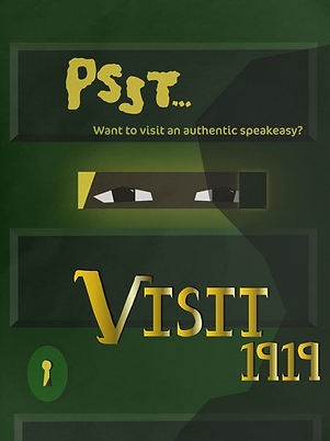
My research focused on how speakeasies were seen in 1919, along with the processes behind them. An example of a process was the production of alcohol and its distribution, known as bootlegging. My newly obtained knowledge of the processes behind speakeasies led to the creation of an infographic showing how to make moonshine in 1919, along with a glamour poster about speakeasies.
Design Process
The tying element between the infographic and the glamour poster was the style present in the year of 1919, futurism. To emulate this style, I used harsh geometric shapes with gradients and unexpected colors that cut through the elements of the design, breaking up an otherwise static image. The most difficult elements of these sister projects was the legibility of text on the infographic, along with the balancing aesthetic appeal and historical accuracy of speakeasies in 1919. The infographic legibility was resolved through using placards of contrasting colors to hold instructive text. Balancing allure and historical accuracy was approached by using images and factual references from 1919 and then adding a twist to them. For example, speakeasies were often denoted by a green door, an element reflected in the illustration of the glamour poster.
Sketches
Glamour Poster


Infographic


Glamour Poster Initial Drafts


Infographic Initial Drafts


Final Deliverables


